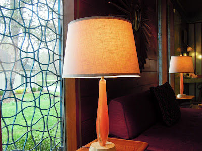
While some might think The Devoted Classicist is comfortable only with houses adorned with Vitruvian-correct columns, this writer admires good architecture of all styles and periods. So it should come as no surprise that the exceptional prefabricated house featured on the cover of ATOMIC RANCH, MID-CENTURY INTERIORS by Michelle Gringeri-Brown with photos by Jim Brown would be so appreciated.
This house, one of eight featured in the book, was constructed in Brighton, a suburb of Rochester, New York in 1957. A recent, sensitive renovation was undertaken with the help of designer Josef Johns. On the surface, this might seem an unlikely match for a designer known for his work in the traditional style to find himself involved with a Ranch style house from the mid-century. "Yet this is no ordinary ranch house," explains Josef Johns about the Alcoa House. "The logical disposition of spaces, the contrast of gleaming surfaces with warm woods, the pleasing mixture of comfort and glamour would seem to place the house in a class by itself. And there is the fact of its being perfectly symmetrical. That's what won me over".
Architect Charles M. Goodman, 1906-1992, was engaged by Alcoa to design a prototype for domestic architecture that relied on aluminum and prefabricated elements. It contains 7,500 pounds of aluminum; the roof, exterior walls, doors, window grilles, interior partitions, folding closet doors, cabinetry, and decorative trim are all aluminum. Twenty-four Alcoa Care-free Homes were built in sixteen states; this is the only one in New York State.
The end walls are supported by wood clad in aluminum and in-filled with plate glass framed by aluminum, and each end has six sliding glass doors. The covered garden court and private bedroom courtyards also contribute to the extension of outdoor living. The Alcoa House reflects a survey of middle-class homemakers who were asked many questions about their preferences for the ideal home and its features. Included were how many bedrooms, bathrooms, kitchen appliances, and even the ideal height for countertops.
The Ranch style house has 1,900 square feet with an open floor plan where the Entrance Hall, Living Room, Dining Room, and Family Room all flow in a U-shape around the Kitchen. The interior walls and cathedral ceiling are finished in wide-plank cypress. There are three bedrooms and two bathrooms.
 |
| Bobby demonstrates the classic comfort of a Barcelona chair in the Living Room as it appears today. The patterned carpet fits into a recess bordered by linoleum. |
 |
| The Living Room today. |
 |
| Aluminum panels in the entrance framed by walnut. |
 |
| The Dining Room today. |
 |
| The Family Room today. Interior designer Josef Johns reupholstered the original sofas as part of a fresh contemporary scheme that pays tribute to the concept of the house. |
 |
| A view of the Family Room showing the decorative grilles. |
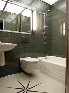
The present owners and their designer have been particularly sensitive in undoing previous renovations and making improvements in keeping with the original design concept. The bathrooms have been fitted with a wall-hanging toilet and lavatory as Goodman intended. And the new kitchen appliances were carefully selected to be sympathetic. And the house is furnished in the style of the 1950s, including the art; many paintings by nationally prominent Rochester artist Robert Marx are particularly suited to the style of the house.
 |
| Bathroom One as improved. |
 |
| Bathroom Two as improved. |
 |
| Bedroom Two as it appears today. |
In 2010, this house was listed in the New York State and National Registers of Historic Places. All the photos are courtesy of the designer Josef Johns of Rochester, New York, and may not be copied or used without his permission.
 |
| Homeowners Steve Plouffe and Mike Linsner with Bobby. |


What an exciting concept originally and then a truly sympathetic and inspired restoration. Congratulations to all concerned but particularly the designer, who chose the stunning upholstery to echo the outside cladding and, I guess, that exquisite floor in bathroom 2. There are so many details to celebrate. Gorgeous.
ReplyDeleteThank you, Rose. I could not agree more.
DeleteI've had the great pleasure of being in this unique home, and the homeowners and their designer have done a great service to the community by restoring this gem to its mid-century look and feel... right down to to the pink rotary telephone in the "gossip nook" tucked into the far corner of the family room.
ReplyDeleteThe Rochester area (like many cities of the northeast and mid-west) is rich with variety when it comes to residential architecture, but this chapter is so often overlooked when it comes to preservation. It's an important part of the story which speaks to the evolution of the way we live, and I'm so glad the designer and homeowners have preserved it for the benefit of all.
I hope to someday visit Rochester, APB. My list of places to see and people to meet there is growing! Thank you for your comments.
DeleteLove the bathroom redo. Especially the rose compass in its modern take. Always nice to see designers step out of their comfort zone and create sympathetic, appropriate and may I say stunning results. Glad to see that Bobby feels at one with his space! Would have loved to have seen the kitchen.
ReplyDeleteThanks for commenting, HBD. See the reader's comment and reply below.
DeleteI've also had the pleasure of being entertained in this chic and stylish ranch. The owners along with their decorator have created a warm and inviting space. In response to the comment from "Home", the kitchen is a highly functional wide galley and was respectfully done over with modern materials.
ReplyDeleteThanks, Roy. Sometimes a photo is not available or not used for a variety of reasons -- and not just because I did not like the image. But the goal is to provide what I would like to know, as much as it is realistically possible and still keep a level of interest. Hopefully, this post sparked enough interest for some readers to research these pre-fab aluminum houses further. Your comment is greatly appreciated, Roy.
DeleteSo enjoyed this story - especially because it was done by the esteemed Josef Johns. My favorite space is the living room - I love that rug!!
ReplyDeletethanks for showing this, what a treat!!
Thanks, Joni! Joseph Johns is an incredible talent and I am glad so many have been able to see this project. The rug/carpet is often the weakest element in a contemporary interior, so it is so wonderful to see such a successful example here.
Delete